6 Mistakes to Avoid Making in Your Home Design
A picture can be worth more than a thousand words.
September 9, 2022
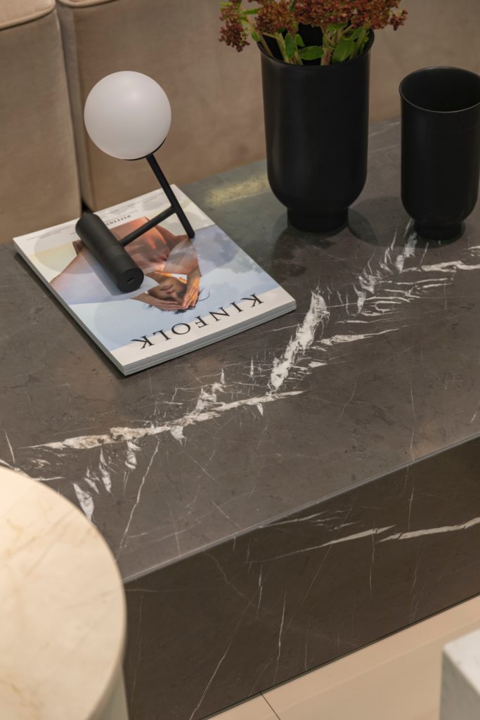
By now you have really, REALLY, gotten to know your home. How does it wear? Does it give you a hug when you come in the door? And then, when you stayed and stayed and stayed, day after day, did it make you feel like it was one of your favorite places? Your home is your largest investment that YOU control and a place that reflects who you are…Really! Let’s make your home work. You, your family and your guests deserve a home that you love.
It’s Design Intervention Time
Welcoming yourself home and your “home hug” is a starting point. Stand in front of your entry doors and capture your first impressions. Inviting? Does it function by serving your needs right away? Is there a place to drop your keys, drop your bags, lights to see, and smells great as well? Take pictures of all that you see on your phone.
Take Pictures of Everything, Don’t Just Look
Stand at the entry to each of your major rooms as well. Does the visual landscape as you enter say you live here and invite you to come in? You could start with analysis of the furniture, walls and floors and lighting. Take the furniture and furnishings — are they good investments? But, this type of blind analysis can get overwhelming. Reality is that maybe something else is the problem.
Take all your pictures from roaming your home, and then sit down and study each. Trust me this will help you see much more than just assessing individual items. You’d be amazed what the picture will expose that the naked eye misses. Now look for clues for what is bugging your eyes. Broadly, it most likely will lie in one of the following six areas:
Assess the scale of items.
One or more pieces may be too large/small in relationship to the others. Make sure that upholstered pieces relate in terms of size. You don’t want one piece being wildly different from the others. Think of the upholstery as one unit in the room, with wood and metal pieces being the other. A smallish chair can gain presence with a skirted slip cover in a light color, as an example. It also takes the fragile feel away especially if there are only a few chairs in the room.
Scale is also a relationship between the interior architecture and the furnishing package.
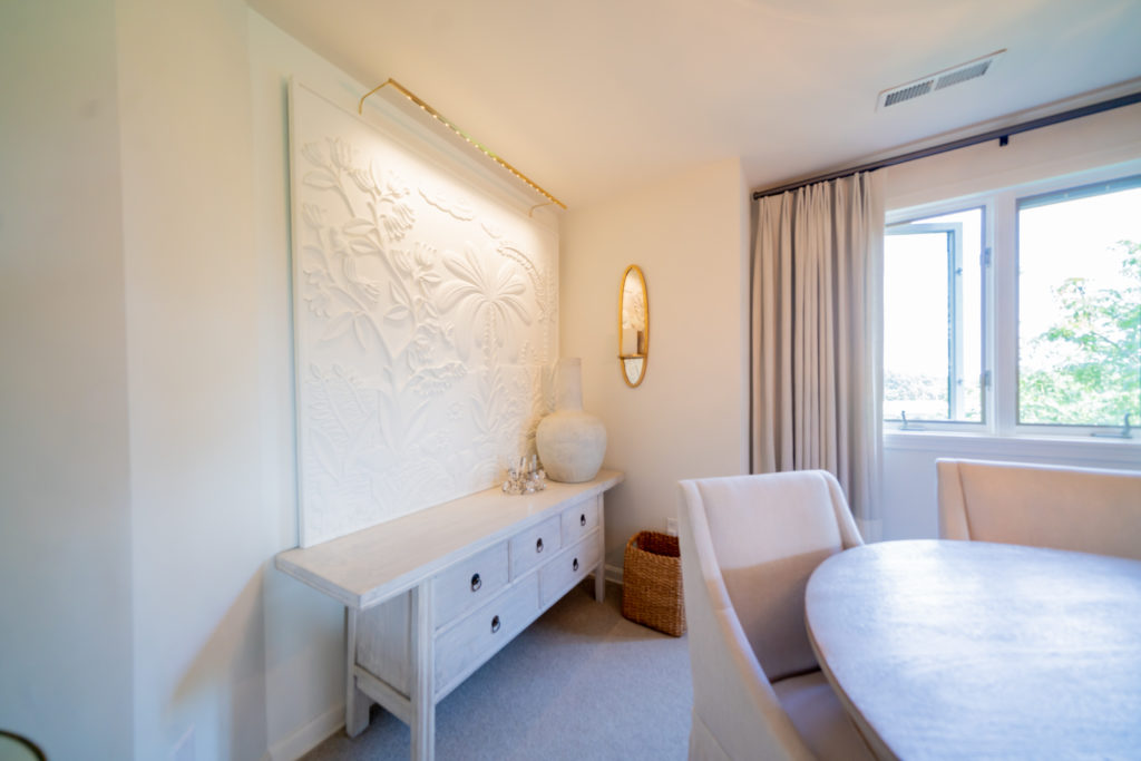
Are there too many colors?
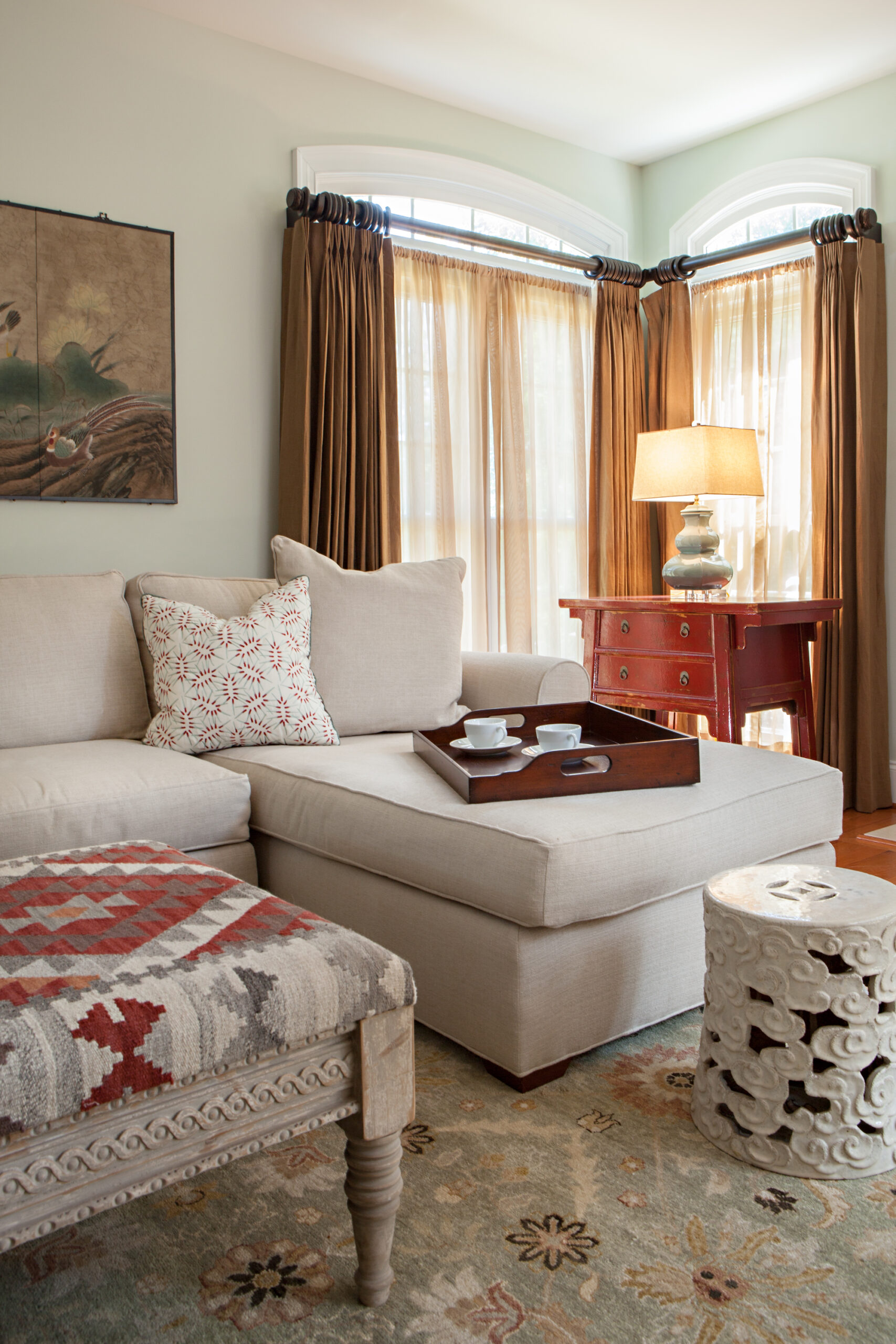
There may be too many colors in the room or some may be missing the mark the result being too busy or a clash. One rule of thumb is that if you are going to have more than one shade of blue, as an example, make sue there are at least three shades of blue involved for if there are only two, it will look like you just mismatched and your eye will not be happy.
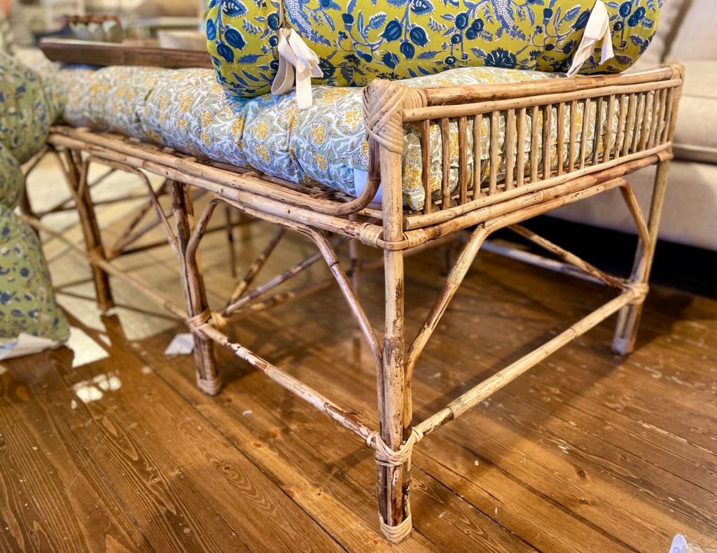
Patterns Can Be Tricky
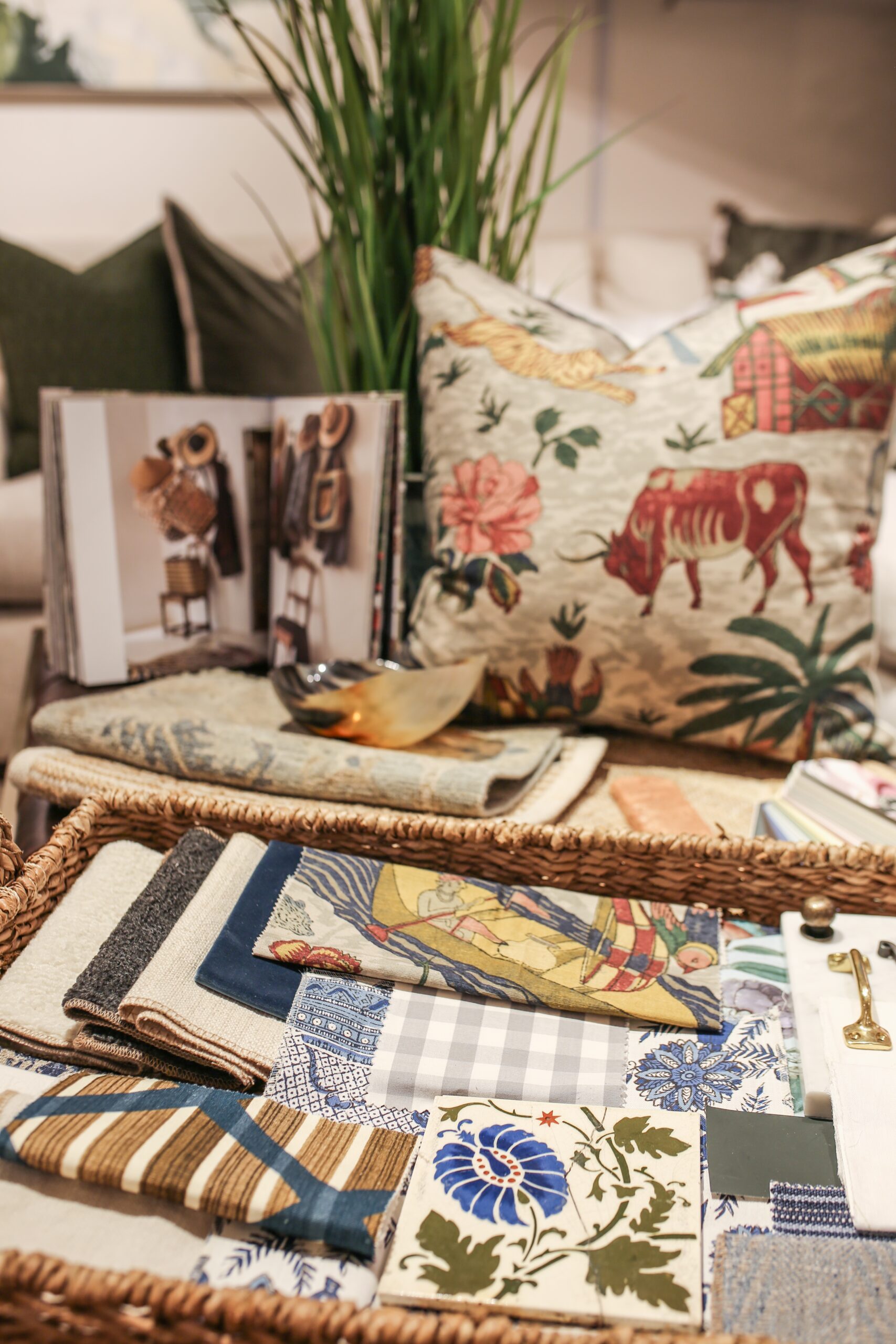
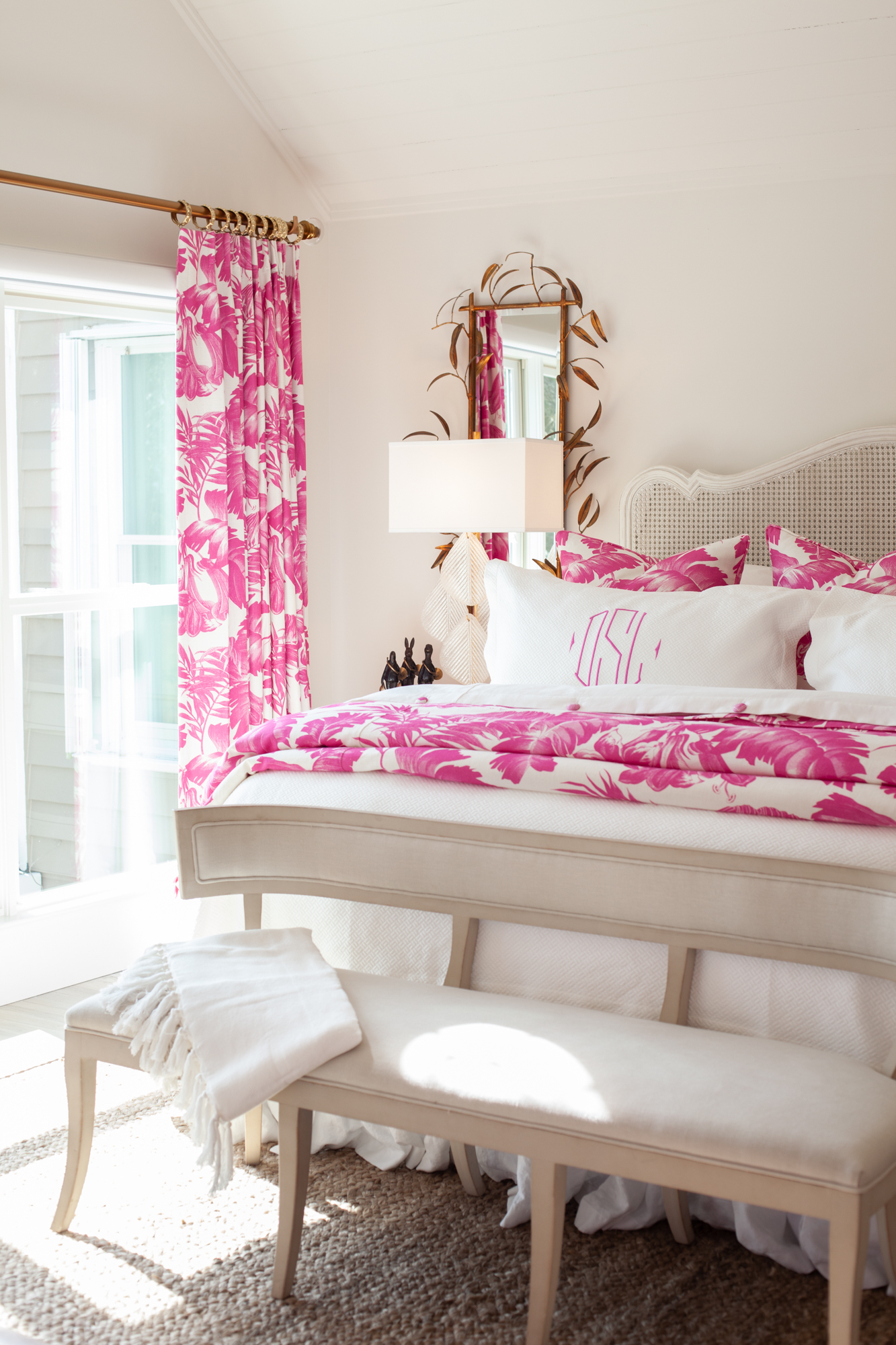
Putting together multiple patterns is a very tricky thing to do as well. We have done dozens of rooms with a dozen different patterns and some rooms with only a few. Again, here, scale is important so mix it up with big, little and medium sized patterns. Like a good soup, a room has to have complimentary ingredients that blend while having impact.
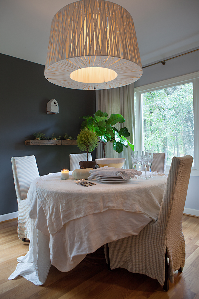
Pay Attention to the Legs
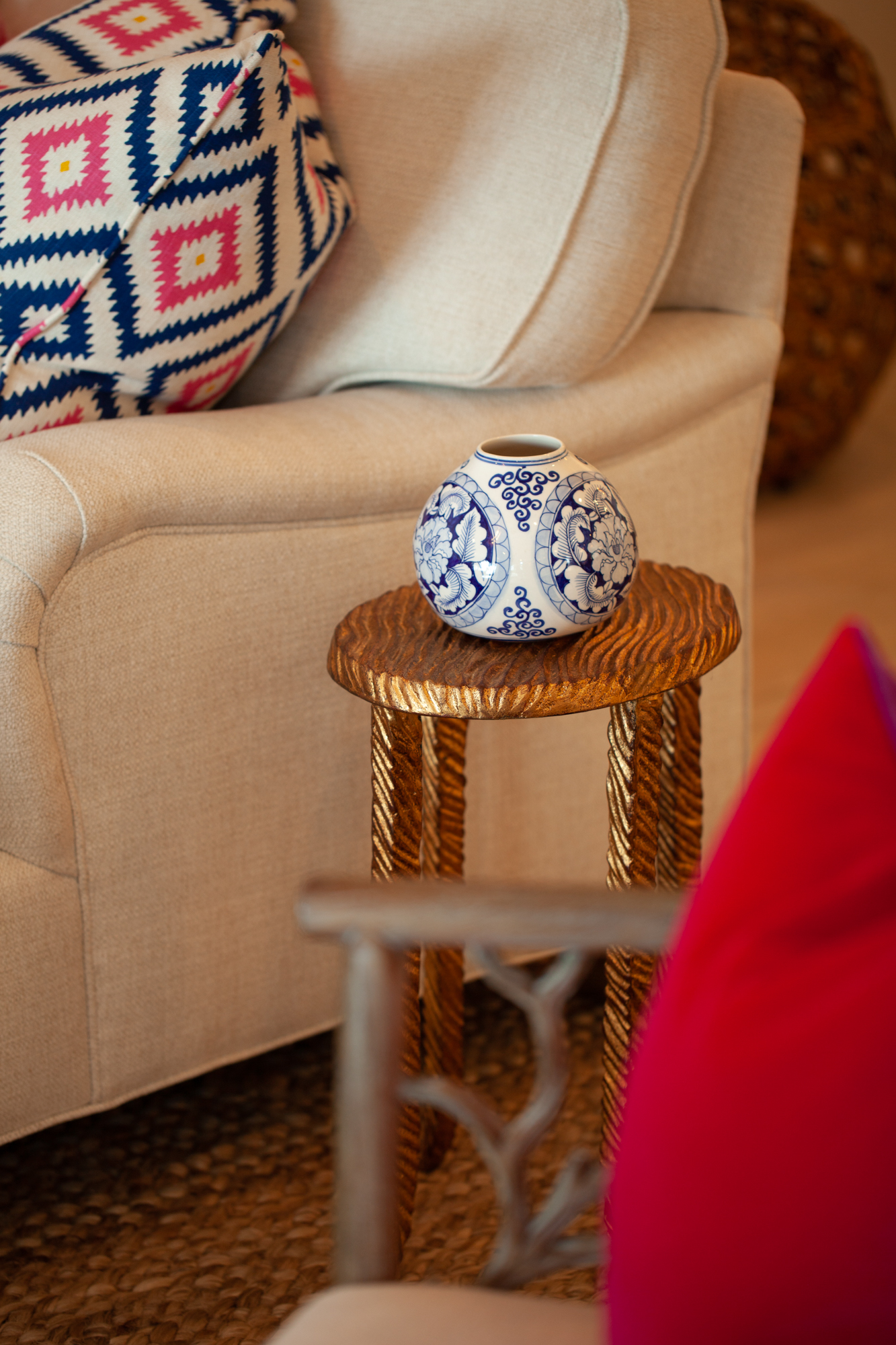
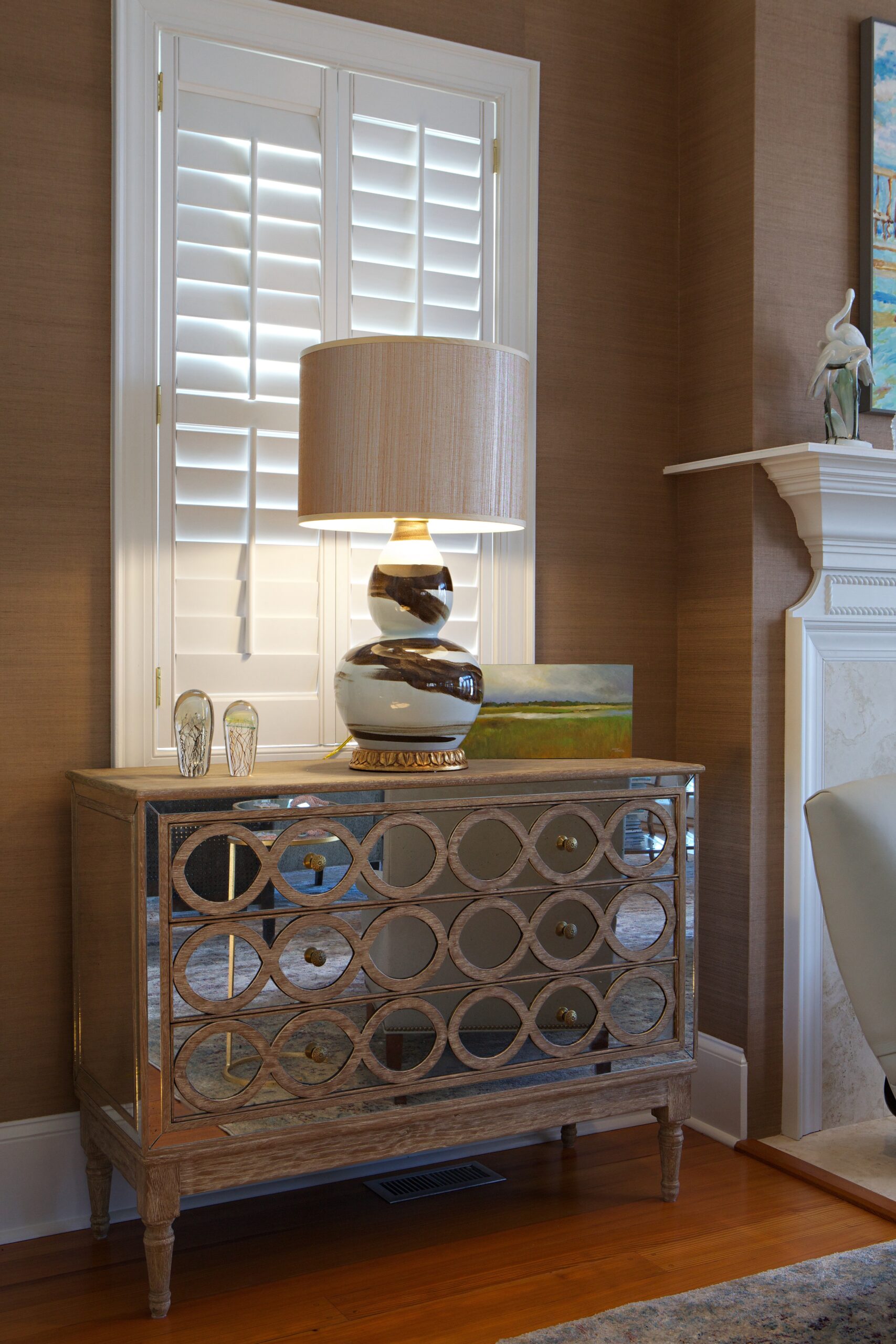
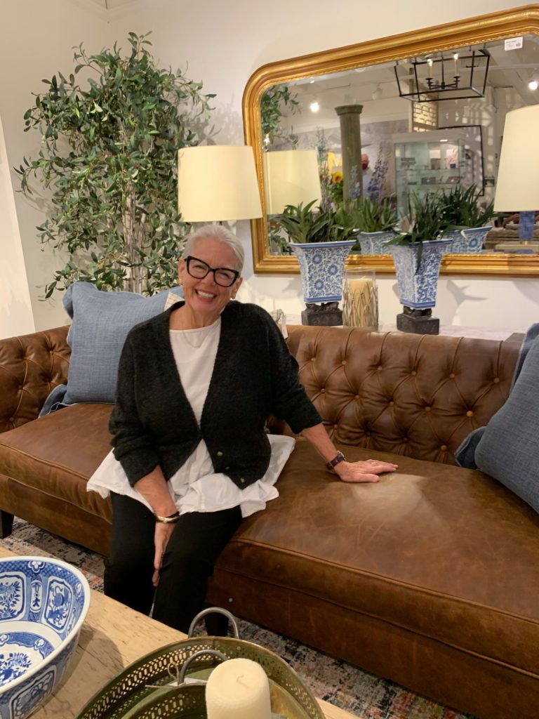
A good chorus line can never have too many, but a room certainly can. If everything is “stickly”, you will feel jumpy. So pay attention to the legs on your furniture. The shapes of lamps can also appear leggy if there are too many tallish, thin lamps…mix up the shapes (ginger jar classics balance well with a candle stick form). A skirted sofa or chair grounds the room so things don’t float away. Shapes within your vision should flow where continuity is desired and be abrupt where there is definition of space within an open plan as an example.
Placement of Wall Art
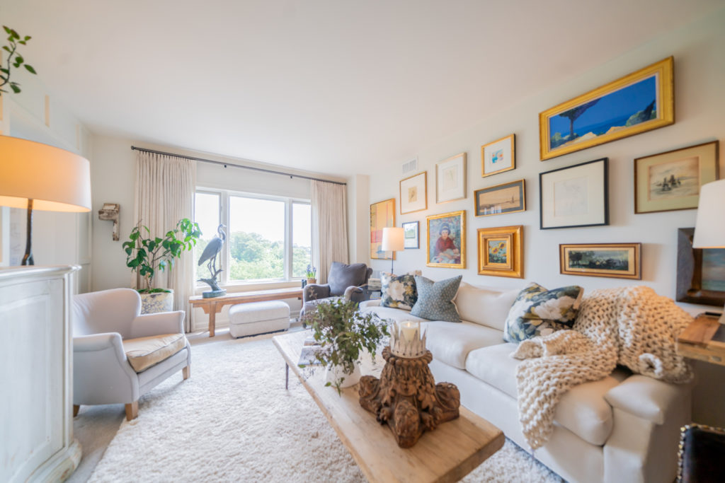
Is your art scattered around or attached to each other in some format or thread? Hanging groups of pictures on a wall will give importance to the wall and are interesting focal point(s). Do not hang the art work too high or too low (most people hang artwork high). When you hang a picture, your line of sight should hit slightly higher than the middle of the picture. Also, when hanging art groups, remember to look at the whole group as one. In addition, if you can step back far enough away from the wall, look at the whole vertical assemblage of lamps and shades, accessories if large, silhouettes of furniture, and your artwork with “composition eyes like an artiste.”
Furniture Arrangements
Often furniture is smashed up against the walls thinking the room will live larger. Not always true. You don’t want to look nor feel like a dentist’s waiting room. Be creative and move your room around thinking about multiple conversation areas for different numbers of family members or guests. Be sure to leave appropriate traffic patterns. walking into the back of a sofa is a no-no, not welcoming and off-putting. If you must put the back of something to the entrance, soften it with a narrow console, large basket for asymmetry, or something else that will break the flat back staring at you. Make sure that you envision how the room(s) will be utilized and by whom so that everyone has a surface upon which to put a book, cup of tea, and/or snack. A chair without the ability to serve its sitter will be forlorn and sad. Give it a companion to keep it company.
Floor Treatments
There are now so many inexpensive options: wood, tile, carpet, rugs and combinations thereof. One common mistake is that the rug size is too small or that you think that all the furniture should be completely ON the rug. Doing this bottom aspect of the design can achieve so many things such as area creation, identification of traffic patterns, as well as the compositional aspects of patterns, textures, colors, layerings, and of course shapes and forms. It is much harder to add the right rug later than it is to think thru the whole room and take action early.
Final Step: List Your Issues To Conquer Solutions
Take your pictures, study them, and then list your issues. Find solutions for each, write them down, but do not take action until all of the individual fixes are identified. Do not complicate the whole big picture nor create other issues along the way by buying more things. Otherwise, you may just keep the buying habit going and pile more “stuff” on the problem instead of fixing the entirety. Once you have all the pieces in place, go into action, find resolutions and make your home your favorite place on the planet as it should be. Make on appointment to stop in and see us or try our new virtual styling program as a starter. Save the before pictures and compare to the after shots.
6 Mistakes to Avoid Making in Your Home Design
A picture can be worth more than a thousand words.

By now you have really, REALLY, gotten to know your home. How does it wear? Does it give you a hug when you come in the door? And then, when you stayed and stayed and stayed, day after day, did it make you feel like it was one of your favorite places? Your home is your largest investment that YOU control and a place that reflects who you are…Really! Let’s make your home work. You, your family and your guests deserve a home that you love.
It’s Design Intervention Time
Welcoming yourself home and your “home hug” is a starting point. Stand in front of your entry doors and capture your first impressions. Inviting? Does it function by serving your needs right away? Is there a place to drop your keys, drop your bags, lights to see, and smells great as well? Take pictures of all that you see on your phone.
Take Pictures of Everything, Don’t Just Look
Stand at the entry to each of your major rooms as well. Does the visual landscape as you enter say you live here and invite you to come in? You could start with analysis of the furniture, walls and floors and lighting. Take the furniture and furnishings — are they good investments? But, this type of blind analysis can get overwhelming. Reality is that maybe something else is the problem.
Take all your pictures from roaming your home, and then sit down and study each. Trust me this will help you see much more than just assessing individual items. You’d be amazed what the picture will expose that the naked eye misses. Now look for clues for what is bugging your eyes. Broadly, it most likely will lie in one of the following six areas:
Assess the scale of items.
One or more pieces may be too large/small in relationship to the others. Make sure that upholstered pieces relate in terms of size. You don’t want one piece being wildly different from the others. Think of the upholstery as one unit in the room, with wood and metal pieces being the other. A smallish chair can gain presence with a skirted slip cover in a light color, as an example. It also takes the fragile feel away especially if there are only a few chairs in the room.
Scale is also a relationship between the interior architecture and the furnishing package.

Are there too many colors?
There may be too many colors in the room or some may be missing the mark the result being too busy or a clash. One rule of thumb is that if you are going to have more than one shade of blue, as an example, make sue there are at least three shades of blue involved for if there are only two, it will look like you just mismatched and your eye will not be happy.

Patterns Can Be Tricky
Putting together multiple patterns is a very tricky thing to do as well. We have done dozens of rooms with a dozen different patterns and some rooms with only a few. Again, here, scale is important so mix it up with big, little and medium sized patterns. Like a good soup, a room has to have complimentary ingredients that blend while having impact.


Pay Attention to the Legs
A good chorus line can never have too many, but a room certainly can. If everything is “stickly”, you will feel jumpy. So pay attention to the legs on your furniture. The shapes of lamps can also appear leggy if there are too many tallish, thin lamps…mix up the shapes (ginger jar classics balance well with a candle stick form). A skirted sofa or chair grounds the room so things don’t float away. Shapes within your vision should flow where continuity is desired and be abrupt where there is definition of space within an open plan as an example.
Placement of Wall Art
Is your art scattered around or attached to each other in some format or thread? Hanging groups of pictures on a wall will give importance to the wall and are interesting focal point(s). Do not hang the art work too high or too low (most people hang artwork high). When you hang a picture, your line of sight should hit slightly higher than the middle of the picture. Also, when hanging art groups, remember to look at the whole group as one. In addition, if you can step back far enough away from the wall, look at the whole vertical assemblage of lamps and shades, accessories if large, silhouettes of furniture, and your artwork with “composition eyes like an artiste.”

Furniture Arrangements
Often furniture is smashed up against the walls thinking the room will live larger. Not always true. You don’t want to look nor feel like a dentist’s waiting room. Be creative and move your room around thinking about multiple conversation areas for different numbers of family members or guests. Be sure to leave appropriate traffic patterns. walking into the back of a sofa is a no-no, not welcoming and off-putting. If you must put the back of something to the entrance, soften it with a narrow console, large basket for asymmetry, or something else that will break the flat back staring at you. Make sure that you envision how the room(s) will be utilized and by whom so that everyone has a surface upon which to put a book, cup of tea, and/or snack. A chair without the ability to serve its sitter will be forlorn and sad. Give it a companion to keep it company.
Floor Treatments
There are now so many inexpensive options: wood, tile, carpet, rugs and combinations thereof. One common mistake is that the rug size is too small or that you think that all the furniture should be completely ON the rug. Doing this bottom aspect of the design can achieve so many things such as area creation, identification of traffic patterns, as well as the compositional aspects of patterns, textures, colors, layerings, and of course shapes and forms. It is much harder to add the right rug later than it is to think thru the whole room and take action early.
Final Step: List Your Issues To Conquer Solutions
Take your pictures, study them, and then list your issues. Find solutions for each, write them down, but do not take action until all of the individual fixes are identified. Do not complicate the whole big picture nor create other issues along the way by buying more things. Otherwise, you may just keep the buying habit going and pile more “stuff” on the problem instead of fixing the entirety. Once you have all the pieces in place, go into action, find resolutions and make your home your favorite place on the planet as it should be. Make on appointment to stop in and see us or try our new virtual styling program as a starter. Save the before pictures and compare to the after shots.
Friday, September 9th, 2022
Let's Be
Friends!
GET ME ON THAT LIST
Sliding into your inbox with home inspiration, helpful tips and tricks from Jane, and weekly blog posts on the latest interior design tips.
Let's Be
Friends!
Sliding into your inbox with home inspiration, helpful tips and tricks from Jane, and weekly blog posts on the latest.
